
How to Color Water, Sand, and Shells on Beach Coloring Pages
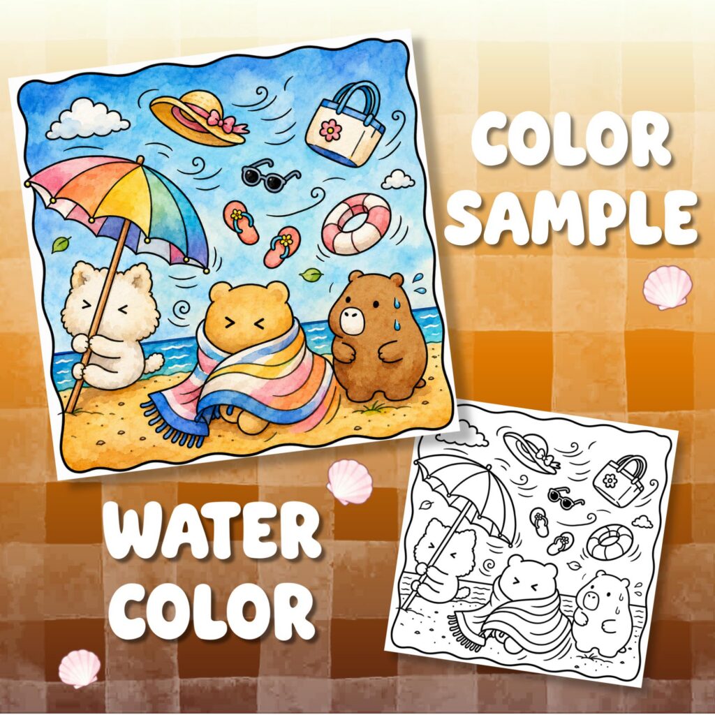
Color water with directional bands, give sand one broad quiet value, and turn the printed lines on shells into curved bands of light and dark. We recommend working in that order because the largest areas establish the page before the small shell details ask for attention. Keep the mark-making distinct: long and broken through the water, sparse across the sand, and curved around each shell.
Choose a compact color family before you begin. Water, sand, and shells can share an accent, but each material needs its own value pattern and stroke direction. That difference is more useful than giving every object a separate color.
Give each material one clear visual rule
Trace the three material groups with your eyes. Find the largest water shape, the open sand around it, and the shells that carry the smallest internal lines. Then assign a simple rule to each group. Water follows the movement printed in the drawing. Sand begins as a calm field. Shell color bends around spirals, hinges, ridges, and openings.
A beach page from our summer coloring book guide can start with one cool family for water, one warm neutral family for sand, and a small accent family for shells. Those are roles, not required hues. If the relationship between the families is the difficult choice, use our complementary and analogous palette guide to choose it before assigning individual colors here.
Within each family, set aside a light, a middle value, and a deeper value. Water may leave some paper open for foam or glints. Sand can stay mostly in its light and middle range. Shells can hold the sharpest small contrast at a spiral center, hinge, or opening. Decide which material gets the strongest contrast so three equally loud treatments do not compete.
Build water around the movement already drawn
Begin with the largest water area and follow the direction of its printed contours. Long shorelines suit side-to-side strokes. A curling wave calls for strokes that turn with its arc. A small pool between objects can use shorter versions of the same movement. Change direction when the drawing changes direction, not at fixed intervals.
Place the lightest water color in broad, interrupted bands. Leave irregular gaps at printed foam shapes and in a few open areas where you want light. Add the middle value in bands of different lengths: one can end early, another can narrow near shore, and another can split around a visible object. Avoid stacking equal stripes from top to bottom.
Use the deepest water value in fewer places. Tuck it into a wave curl, beside selected foam shapes, or between overlapping water bands. Then carry the base color through part of any division that looks too rigid. The goal is a connected body of water with visible movement, not a row of separate ribbons.
Treat foam as a larger shape before considering its tiny bubbles or scallops. Keep much of it open, place a pale cool value along only a few inner curves, and let occasional water marks enter the widest foam areas. On calm water, make the bands longer and quieter; around a breaking wave, shorten and bend them with the printed turn.
Let the shoreline change the mark-making
Use the shoreline as a handoff rather than outlining it with a heavy new color. Let the final water bands approach the printed edge at a slight angle or broken curve. Shorten a few bands before they arrive, while allowing others to meet the line. This variation prevents the boundary from becoming one continuous stripe.
On the sand side, begin the broad base close to the shoreline and move inland with wider, calmer strokes. If a damp strip suits the drawn scene, place one narrow, slightly cooler or deeper value beside part of the waterline. Keep that strip interrupted so it remains a small transition within the sand rather than another full gradient.
Where printed foam crosses the waterline, color around its shape instead of drawing a second boundary through it. Where the line is open or lightly indicated, let the change in marks do the separating: directional color on the water side, quiet value on the sand side. Leave dense sand texture away from the busiest foam so both materials have room at their meeting point.
Keep sand broad, quiet, and sparsely textured
Cover the main sand shape with one light base before adding individual grains or marks. Work across each open area in a steady route, joining neighboring patches of the same value so the beach does not break into unrelated spots. A little variation is enough; the base should still occupy most of the visible sand.
Add texture in selected clusters rather than spreading it evenly. Use a few dots, short dashes, or shallow curves near a printed footprint, shell, grass tuft, or other visible detail. Repeat one or two of those marks nearby, then leave a wider stretch untouched. Change the spacing more often than the mark itself.
At the base of a shell or prop, one short, slightly deeper contact value is enough; keep the surrounding sand open. If a printed contour already supplies texture, let it lead instead of laying another pattern across it.
For a broad-color stage followed by small pencil marks, our guide to using crayons and colored pencils on the same page gives that tool handoff its own clear sequence. Complete the open sand before turning to the shell interiors, so scattered details do not pull attention away from the larger field.
Finish with curves that give shells their form
Start each shell with a broad base color, then choose the printed feature that best describes it. On a fan shape, that feature may be the hinge and the ridges spreading outward. On a spiral, it is the center turn. On a shell with an opening, it is the dark interior beside the outer lip. Let that feature direct the next value instead of filling every enclosed strip differently.
Curve a middle value along selected ridges or turns, leaving slim paths of the base color between them. Place the deepest value in a smaller area near the hinge, center, or opening. Avoid tracing the entire outside edge in one dark color; a few internal value changes can define the form while the printed outline remains clear.
Across a shell group, repeat a limited family but change its order. One shell might keep the warm neutral as its base and use a cool accent in the grooves. Another can place that accent on the base and reserve the neutral for a lighter ridge. This connects the group without making every shell identical.
Cozy Summer Beach Adventure Coloring Book includes ocean waves and seashells, two subjects that directly match this water-to-shell sequence. Choose the visible feature you want to practice and give it the corresponding marks. Get it on Etsy.
For the last shell, deepen only its spiral center, hinge, or opening, carry a middle value around the next curve, and leave a slim light strip at the outer lip.
Twelve free printable coloring pages
Two pages from each of six books, free and with no email required. Download the free pages.
Email me when a new Coloring Nest book is released. Nothing else.
Printable PDFs