
Layer a Sakura Picnic Coloring Page: Background, Props, and Characters
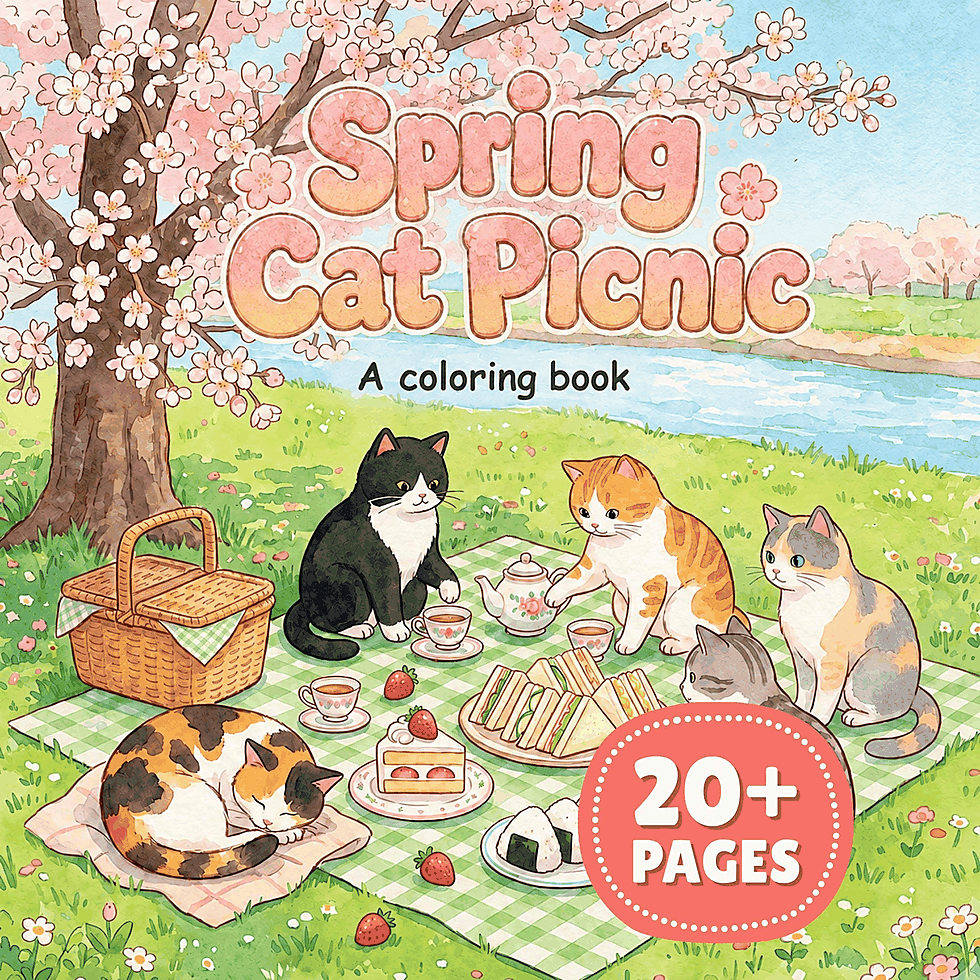
Layer a sakura picnic coloring page by choosing the leading character first, then assigning every other shape one of two supporting jobs. The background holds the setting together. The props carry the eye toward the action. The characters receive the clearest value changes and the most deliberate details.
We use color area, contrast, and edges to keep those jobs distinct. A layer does not need its own separate palette, and the background does not have to be pale. It only needs to ask for less attention than the layer in front of it. Plan that order before filling small flowers or food details, and each color choice will have a reason.
Map the Scene Around One Leading Character
Point to the character you want to notice first. From there, follow the printed overlaps outward. Shapes hidden behind that character move into a supporting role; objects touching the action become props; large connected areas behind both become background. Write background, props, and characters on scrap paper, then place a few important shapes under each heading.
Sort by visual role rather than object name. A blossom beside the leading character may act as a prop, while a larger group of blossoms behind the action can belong to the background. A structure can recede as one broad shape even when its line work contains many smaller parts. Keep connected forms together until an overlap clearly separates them.
If you are still choosing a project, our Japanese coloring book guide gathers related Coloring Nest themes in one place. Once the page is chosen, the overlap method in our guide to creating depth in cozy interior coloring pages offers another useful way to read near and distant groups.
Printable Japanese Spring Cat Picnic Coloring Book pairs bold cat characters with medium-detail food and flowers. Choose one cat to lead, gather the nearby food and flowers into the prop layer, and keep the surrounding shapes quieter. Get it on Etsy.
Give the Background One Quiet Rhythm
Begin with the broadest connected areas behind the picnic. Choose a close family of values for those shapes before deciding how to color every division inside them. Repeating a pale, middle, and slightly deeper version of one hue can make separate background areas read as a single setting.
Treat blossom groups as masses before individual petals. Lay the lightest color across most of a group, add a middle value where clusters overlap, and keep the deepest version away from the outer edges unless that spot supports the focal area. A few open paper spaces can separate crowded petals without turning each one into a tiny highlight.
Quiet does not mean washed out. A background can carry rich color when its value jumps stay modest and its smallest details remain restrained. If one distant shape needs a dark value, repeat a related middle value nearby so the dark does not stand alone. Save the sharpest dark-light meeting for the character layer.
Work across repeated background shapes instead of completing one corner at a time. When the same color appears in several places, vary its amount rather than inventing a new combination for each cluster. The result is a visual rhythm that supports the picnic without creating several competing destinations.
Use the Props to Carry the Eye Through the Picnic
Find the largest connected prop group and establish its main value first. Then color the smaller food, flowers, and visible picnic objects around it. Props need more separation than the background, but they do not all need a full light-to-dark range. Give the clearest range to the object nearest the action and let the others share quieter versions.
Repeat a character color in one prop, then echo a background hue in another. Those small handoffs connect the three layers without making them identical. A warm accent near the character can return in less space farther across the picnic, creating a route for the eye rather than a ring of equally bright spots.
At each overlap, decide which side carries the contrast. If a pale prop touches a pale background shape, deepen a short section behind it or choose a middle value for the prop. If both shapes are dark, preserve a light gap or lighten the shape that matters less. Keep the change close to their shared edge instead of outlining the entire object.
When the palette relationship is still undecided, our guide to complementary and analogous coloring-page palettes can help choose whether the prop accent should connect gently or stand apart. Give that chosen accent a small, specific route through this scene.
Build the Focal Character from the Silhouette Inward
With the surrounding values in place, fill the leading character’s largest shapes before its facial features or tiny accessories. Look at the outer silhouette against the background and props. If part of it disappears, change one of the touching values rather than adding a heavy border around the whole figure.
Place the widest value range where it supports the character’s action. A light face beside a deeper neighboring shape, a dark feature inside a calm face area, or a small bright detail against a quieter body color can lead the eye. The strongest contrast does not need to cover the largest area; a compact change near the face or gesture can carry more attention than a broad dark fill.
Let supporting characters borrow the same palette with fewer extremes. They can share the main hue while using a narrower value range, or repeat the accent in a smaller amount. This keeps them related to the leading character without giving every face and outline equal force.
Add small details only where they strengthen the reading order. Clarify the leading face, the gesture, and the nearest overlap first. Leave repeated marks elsewhere simpler. We want detail to explain the action, not to become a uniform layer spread across every available shape.
Join the Layers at Their Shared Edges
Bring the three groups together by repeating hues with different strengths. A background pink can return as a clearer middle value on a prop and a deeper accent near the character. A quiet neutral can move the other way, appearing darkest in a narrow character detail and palest across the setting. The hue creates continuity; its changing value keeps the layers apart.
Give special attention to the edges where the reading order changes. Where a prop crosses the background, make one short boundary clear. Where the character crosses a prop, reserve the stronger contrast for the character side. Allow other boundaries to stay gentle so the important overlaps have room to speak.
Look at the page from your usual viewing distance. The leading character should appear before its small details are inspected, the props should form a connected route through the picnic, and the background should register as one setting. If a distant cluster pulls forward, bring its values closer together. If a prop vanishes, strengthen only the overlap that identifies it. Stop when the character leads, the props support the action, and the background holds everything in a clear hierarchy.
Twelve free printable coloring pages
Two pages from each of six books, free and with no email required. Download the free pages.
Email me when a new Coloring Nest book is released. Nothing else.
Printable PDFs