
How to Color Tea-Party Pages: Flowers, Ceramics, and Wood
Choose the light direction before adding color. Keep the light-facing petal edges pale, leave a clean highlight on the same side of the ceramics, and place the deepest wood shadows where objects meet the table. Then change the kind of mark you use for each surface: curved strokes for flowers, broad value bands for ceramics, and long broken lines for wood. The shared light holds the page together while the different marks keep nearby shapes distinct.
The floral, home-centered mood is part of the appeal explored in our cottagecore coloring book guide. On a tea-table page, we can make that mood readable with a small color plan and three clearly different surface treatments.
Map the Light and the Strongest Contrasts
Imagine the light entering from one upper corner. Notice which side of each flower, ceramic shape, and wooden surface faces it, then find the opposite edges and overlaps where shadows can gather. You do not need an arrow on the page; a short note beside it is enough to keep the direction steady.
Choose a light, middle, and dark value that can travel through the whole scene. The flower colors may vary, and the wood may sit in its own brown family, but one deepest neutral can connect narrow gaps, contact shadows, and tucked edges. Using that dark sparingly gives the arrangement structure without tracing every shape.
Now compare the colors planned for touching areas. A pale bloom beside a pale cup needs a value break, perhaps a darker flower center, a shaded petal edge, or a slim ceramic shadow. Our guide to complementary and analogous coloring page palettes can settle whether the flower hue should blend with the ceramic color or stand apart from it. Carry that relationship through the page instead of introducing a new answer at every boundary.
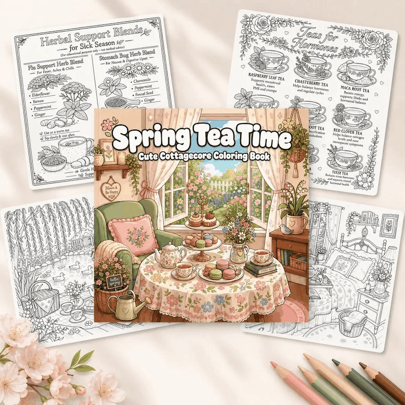
Spring Tea Time Cottagecore Coloring Book has medium-detail floral and tabletop scenes with smaller decorative objects, making it a fitting place to practice these three surface treatments. Get it on Etsy.
Shape Flowers With Directional Layers
Lay the lightest flower color across the petals first. Leave a slim pale area toward the light, then bring a middle value up from the base of each petal. Let the strokes travel toward the outer edge. That direction suggests the way the petal opens and keeps the shading from looking like a band drawn across it.
Use darker color where one petal slips beneath another, not around the full flower. A narrow shadow at the tucked edge separates the layers more gently than a heavy outline. Vary the depth from petal to petal: the overlap nearest the shadow side can carry more dark, while a petal facing the light can stay mostly in the base color.
Color the center after the larger petal shapes are established. A warm center can echo the wood, while a deeper cool center can separate pale petals from pale ceramics. For leaves, begin with one main green and pull the darker marks away from the base or printed center vein. Keep some leaf areas simple so the flowers remain the clearest accents.
If several blooms appear across the page, let one group lead. Give it the fullest light-to-dark range, repeat the main hue in a smaller bloom, and use quieter versions elsewhere. Unequal repetition connects the flowers without making each one demand the same attention.
Build Ceramics Around a Quiet Highlight
Read a cup, pot, saucer, or similar shape as a broad form before working on decoration. Cover most of it with a light base, leave a narrow highlight on the side facing the imagined light, and place a calm middle value on the opposite side. The transition should be wider and smoother than the strokes in the petals.
Follow the curve already suggested by the outline. On a rounded body, let the value change bend gently from top to bottom. Keep the inside of a rim darker than its light-facing outer edge. On a handle, a pale outer curve beside a darker inner curve separates the opening while keeping it connected to the body.
Add any drawn pattern only after the broad form reads clearly. Let its color soften as it crosses the highlight and deepen slightly on the shadow side. The pattern will follow the ceramic curve instead of sitting on top as a flat strip. Keep the deepest value to a small opening, overlap, or contact point.
When a pale ceramic shape meets a pale flower, decide which edge owns the contrast. Darken the flower center or the ceramic shadow side, but avoid strengthening both equally. One clear edge is enough, and the quieter surface gives the other room.
Use Wood Grain as a Supporting Rhythm
Begin the wooden shape with a quiet base. Find its longest direction, then add a few grain marks that travel with it. Break the lines, vary their length, and leave generous gaps. Evenly spaced stripes can pull attention away from the flowers and ceramics, while a handful of tapered marks suggests texture without filling the surface.
Place the middle brown along selected joins and on the side turned away from the light. Use the darkest brown beneath a ceramic shape, inside a drawn knot, or where two wooden pieces meet. If a knot is present, bend one or two nearby grain marks around it rather than surrounding it with a dark ring.
Let the amount of grain respond to its neighbors. Wood beside a patterned cup or a dense flower group can stay nearly plain, with only the base and a contact shadow. A more open wooden area can carry several longer marks. This change in density makes the grain feel deliberate and keeps it in a supporting role.
Join the Surfaces With Color and Contact Shadows
Bring the materials together by repeating color in smaller amounts. A muted flower hue can appear in a ceramic pattern. A warm flower center can echo the wood base. A cool ceramic shadow can reappear beneath a leaf. The repeat should be quieter than the place where the color first leads, so the eye can follow it without losing the focal group.
If a dessert shape sits near the cup, choose its colors with our easy pastry palette guide and connect it to the table with the same small family of contact shadows. That lets the added detail belong to the arrangement without borrowing the marks used for petals, glaze, or grain.
Use contact shadows to clarify the stack of surfaces. Deepen the narrow area beneath a cup, pot, stem, or leaf, then let the shadow soften as it moves away. Keep the shadow on the side opposite the highlight. Where two dark shapes touch, lighten one edge instead of adding another heavy outline.
Repeat the light direction in the smallest details too. A ceramic pattern becomes lighter through the highlight, a petal edge stays pale on that side, and wood grain grows quieter as it enters the light. With those cues aligned, the three surfaces share one light direction.
Twelve free printable coloring pages
Two pages from each of six books, free and with no email required. Download the free pages.
Email me when a new Coloring Nest book is released. Nothing else.
Printable PDFs