
Color Cozy Camping Scenes: Warm Light, Foliage, and Night Sky
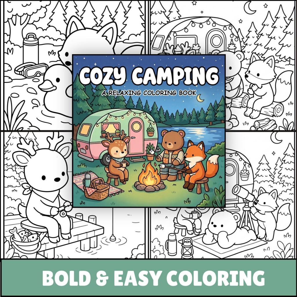
Color a cozy camping scene by mapping the light before filling the details. Reserve a pale cream for the drawn light source, choose amber for the nearest lit edges, hold two greens for foliage, and give the sky a middle blue plus a deeper blue-violet. Keep the brightest warmth small, let the greens form the transition, and give the cool sky the most space.
Work outward from the source rather than coloring one object at a time. Place warmth only on surfaces that face it, cool the foliage as it moves away, and deepen the sky around the outer area. Apply this map to the light, leaf, and open-sky shapes already drawn, so the line art tells each color where to stop.
Give Six Colors Distinct Jobs
Start with the mood you want from the warm and cool sides. If you are choosing a seasonal subject, our summer coloring book guide gathers pages and themes for different summer moods. On the page, find the drawn light source, the broadest open sky shape, and the foliage between them.
A pale yellow-cream and muted amber can lead the warm side, while a deep blue or blue-violet anchors the cool side. Add a quieter blue for the main sky area, then choose two greens that remain distinct beside it. The exact hues can change, but their light-dark order needs to stay clear.
If you want to decide whether the greens should sit close to the sky or contrast more strongly with the glow, our guide to complementary and analogous coloring page palettes explains those relationships. Here, give each chosen color one practical job instead of spreading every hue everywhere.
Arrange the swatches from lightest to darkest. Pale warm belongs at the source; amber on the closest facing surfaces; middle green in lit foliage; dark green in cooler leaf groups; quiet blue across open sky; and blue-violet in selected outer areas and gaps.
Compare the pairs that will touch. Amber and middle green need a visible value step, as do dark green and sky blue. If a pair merges, lighten one or deepen the other instead of adding another hue. Plan the area too: pale center tiny, amber small, greens moderate, sky broad, and deepest dark selective.
Let Warm Light Travel Across Facing Surfaces
Begin inside the drawn source and keep its palest color compact. Add amber around part of that center, breaking the band wherever an outline interrupts it. The glow should touch surfaces, not form a complete yellow circle over every shape.
Find the planes and edges turned toward the source. Give a nearby side a narrow amber strip and a more directly facing surface a wider warm area. Let the object’s local color return as the surface turns away. This pale-to-amber-to-local sequence shows direction without turning the entire object orange.
On a small detail, one slim warm edge may be enough. On a broader shape, use three uneven steps: the palest note at the closest edge, amber just beyond it, and local color across the remaining area. Uneven widths help the color follow the drawn form rather than becoming stripes.
Repeat amber in diminishing amounts. Let the largest warm patch sit nearest the source, add one or two smaller echoes on nearby facing edges, and allow the far side to stay cool. Equal amber dots compete with the source; unequal echoes point back toward it.
Keep the direction consistent as the outlines change. If the source sits low on one side, warm the lower or side-facing edges that point toward it. Leave edges facing away in their local colors. This creates a path of warmth carried by existing surfaces, not a separate halo floating above them.
Group the Foliage, Then Shape the Sky
Read the foliage as connected masses before coloring individual leaves. Make one group nearest the glow, another beyond it, and a cooler group against the sky. Give each mass a main value so later leaf variation keeps the larger light pattern intact.
When overlaps make the groups hard to place, our guide to creating depth in cozy coloring pages can help sort the visible layers. Organize each green group by its relationship to the light: warmer and lighter near it, clearer in the middle, cooler and deeper farther away.
Keep most of the nearest mass green. Add muted gold or yellow-green only to selected edges that face the source. Use the middle green across the connected body of the mass, then place the dark green in small gaps and along cooler outer sections. On the far group, reverse the balance: let the dark green lead and use the middle green sparingly on visible edges.
For the sky, cover the broad open area with the quieter blue before placing the deepest dark. Deepen selected outer sections and narrow spaces behind lighter shapes. Leave a softer blue passage near the glow, and let drawn outlines interrupt it instead of making a perfect ring.
Compare the darkest foliage with the sky where they meet. When they look too similar, cool the sky slightly, warm the green slightly, or lighten one short leaf edge. Change only the shared boundary that needs separation instead of tracing the entire foliage mass with a dark line.
Cozy Camping Coloring Book has medium-detail backgrounds. When a chosen page includes the shapes in this article, assign its light, foliage, and open sky to the map before coloring the smaller details. Get it on Etsy.
Apply the Map From the Light Outward
On a page with a low light source, foliage rising around it, and open sky above, place pale cream inside the source first. Touch amber to the nearest facing edges, using a wider patch on the closest broad surface and a thinner note on smaller shapes nearby. Leave the farthest shapes cool so the source keeps a clear center.
Move into the foliage with middle green. Connect several leaves into one lit mass, add muted gold only at a few source-facing edges, and place dark green in the spaces between clusters. As the foliage curves away, increase the dark green and reduce the warm notes. The change should happen by group, not in an alternating light-dark pattern on every leaf.
Fill the open sky with the quieter blue, working around any light shapes already printed there. Add blue-violet along the outer sky and in a few narrow gaps where foliage needs a deeper neighbor. Keep the sky beside the glow a little lighter, then let it deepen in broad, irregular sections rather than equal bands.
Carry a little sky blue into the coolest foliage, place one muted amber echo on a nearby drawn shape, and deepen only a few gaps with blue-violet. Those repeated notes join the areas without scattering equal accents across the page. The applied map is pale cream at the source, amber on the closest facing edges, middle green across the lit foliage, dark green through the cooler leaves, deep blue over the open sky, and blue-violet at the outer sky and narrowest gaps.
Twelve free printable coloring pages
Two pages from each of six books, free and with no email required. Download the free pages.
Email me when a new Coloring Nest book is released. Nothing else.
Printable PDFs