
Build a Personal Palette for Your Zodiac Cat Coloring Page
Start with one real color reference—a familiar scarf, a well-used mug, or an existing photograph—and pull a few precise hues from it. Keep the way those colors sit together: deep blue beside faded gold, for example, or cream between two warmer notes. Repeat that relationship through visible details on the zodiac cat page you already selected. The page feels personal because it carries a color memory you recognize.
Place the page you picked with our guide to choosing zodiac cat coloring pages by sign beside the reference and your coloring tools. Decide what makes the source recognizable: an unusual pairing, an interrupted stripe, or a color returning after gaps. Carry that connection onto the page.
Choose one reference with a clear color memory
Use one item or image from your life rather than collecting several sources. A scarf may hold a familiar sequence, a mug a memorable painted edge, or an existing photograph the colors of a particular day. Choose the reference whose colors you can picture after you look away.
A page from our zodiac and seasonal coloring collection can take its direction from any such source. Look at the selected page and reference together. Carry the source’s color meeting into visible printed details, allowing the drawing’s own shapes to hold it.
Narrow your attention to one part of the reference. The edge of a sleeve, the curve of a cup, or a photograph corner is enough. Name what catches you in concrete terms: “dusty blue beside worn gold,” “tomato red broken by cream,” or “green returning between charcoal lines.” A precise observation is easier to repeat than a broad mood.
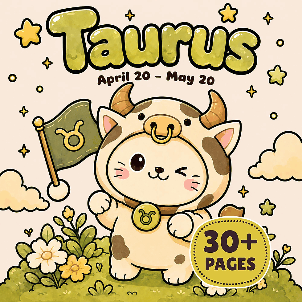
If Cozy Taurus Zodiac Coloring Book is your selected title, keep its chosen page beside that one reference while you identify the relationship to carry across. Get it on Etsy.
Lift a few exact hues from specific spots
Choose three or four hues that make the selected part of the reference recognizable. Work from one visible spot at a time. Cover nearby colors with plain white paper if they distract you, bring likely tools close to the exposed color, and choose the closest match from the tools you plan to use.
Give each choice a source-based name such as “blue from the cuff” or “cream from the rim.” That name points back to one color instead of leaving every blue or cream in play. Write the name and the matched pencil or crayon on a loose note beside the page.
You may recognize the hues as analogous or complementary; our guide to complementary and analogous coloring-page palettes shows how those relationships work. Keep your notes tied to the source: its exact blue, cream, and gold already show which colors belong together.
Stay with the version of each hue found in the small part you named. If gold changes from pale to deep across a scarf, match the gold beside your selected blue rather than gathering every gold in the fabric.
With Printable Gemini Cat Coloring Book as your chosen title, keep those source-based names beside the selected page so every later repeat points to the same personal reference. Get it on Etsy.
Notice what the source colors do together
Look at the spaces between the chosen hues. Notice which two meet, which one interrupts another, and which returns after a gap. Blue beside gold, gold at a blue edge, and cream repeatedly separating them are three different relationships, even when the colors stay the same.
Describe the arrangement in one direct sentence using your source-based names: “Cream breaks the red wherever the pattern repeats,” or “The cuff blue returns beside worn gold.” Its visible order and repetition give you a practical plan for the selected page.
Follow the simplest relationship that still recalls the source. If it contains many colors, keep the pairing or sequence you noticed first. If one hue makes a single memorable interruption, let that interruption remain special.
For a selected page from Printable Cancer Cat Coloring Book, find one recurring detail where the source pair can meet again, and keep the next hue for a separate interruption in your plan. Get it on Etsy.
Carry the relationship through repeated visible details
Scan the chosen page for a printed detail that appears more than once, or for two neighboring shapes that recur as a pair. Work only with details that are visible. A repeated outline, enclosed mark, border element, or paired shape can carry the connection without needing a name.
Begin with one occurrence. If cream interrupts red in the source, place those exact hues where one repeated detail breaks another. If blue sits beside gold, keep that adjacency in the first pair you color. If a darker hue returns after gaps, let it reappear in separated instances of the same detail.
Move to another occurrence elsewhere and echo the same connection. The shapes can differ while the color meeting stays familiar. Blue can sit beside gold in one pair and return beside it in another; cream can break two different runs of red. The personal source travels through the drawing without becoming a rigid pattern.
Leave some occurrences untouched until the first repeats are visible together. When another color is needed, draw from the hues you lifted rather than adding an unrelated choice. A source color can stand alone elsewhere, but repeat the distinctive pairing or interruption where you want the personal echo to be strongest.
Keep this as one personal coloring choice for the selected page. The reference supplies the colors, and the printed details give them places to meet again.
Let the personal echo grow across the page
Keep the reference within view as you color. Start with the first meeting of two source hues, move to a separated repeat, and let the connection build gradually. You can see the relationship forming before other colors fill the spaces around it.
When a visible detail does not suit the chosen pairing, use another exact hue from the source on its own. Not every part of the page needs the full relationship. A few clear echoes feel more personal than scattering every selected color into every available place.
Set the reference beside the page from time to time and find the feature you named at the beginning: the interrupted red, the blue-and-gold adjacency, or the returning green between charcoal lines. Continue that connection in the remaining repeated details. If one isolated color pulls attention away, use the next open detail to bring back the source pairing.
Let the last repeated detail complete the memory rather than introduce a new idea. The scarf’s blue and worn gold can meet once more, the mug’s cream break can return through the selected linework, or the photograph’s green can reappear beside charcoal. Set the personal reference beside the already-selected sign page: the same exact hues now meet in the same recognizable way, visibly carrying your color memory into the zodiac cat page.
Twelve free printable coloring pages
Two pages from each of six books, free and with no email required. Download the free pages.
Email me when a new Coloring Nest book is released. Nothing else.
Printable PDFs