
How to Color Hedgehog Fur, Strawberries, and Garden Leaves
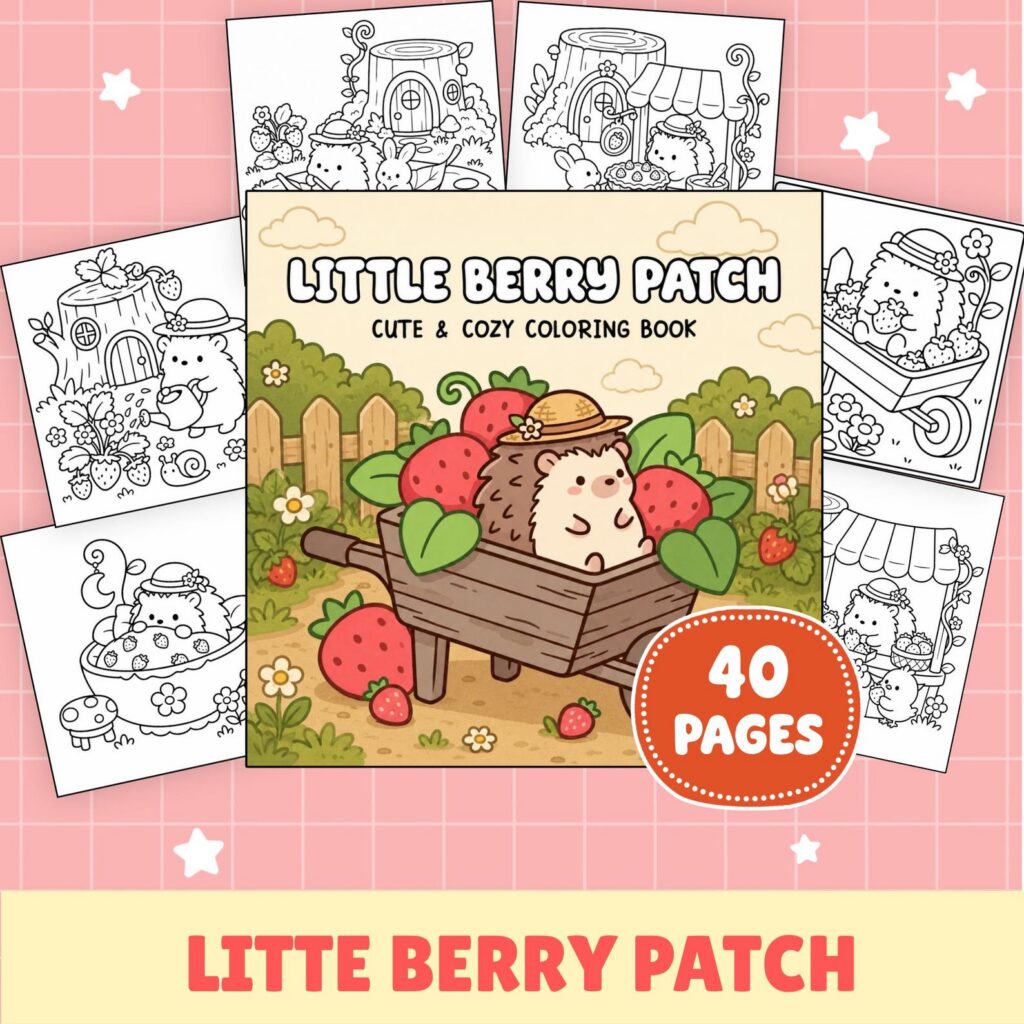
Give each subject its own hand movement: short tapered marks for the hedgehog’s drawn texture, curved color bands for strawberries, and strokes that open away from a leaf vein. Begin each shape lightly, add the directional marks with a middle value, and save the darkest color for a few overlaps. The change in movement does more to separate these surfaces than a long list of colors.
We like to make the hedgehog the most broken and textured, keep the fruit smooth and rounded, and let the leaves sit between them. That simple contrast gives every pencil stroke a reason to be there.
Start With Three Contrasting Motions
Before coloring a full shape, put the three marks beside one another on scrap paper. Flick a short line and lift the pencil so its end narrows. Draw a shallow curve that could wrap around a berry. Then pull a slightly longer stroke away from an imaginary center vein. If two samples look too similar, change their length, spacing, or direction now.
Let the printed drawing lead your hand. Existing spine marks can set the angle for the hedgehog texture. The outer curve of a strawberry shows how its color bands should bend. A printed vein gives each leaf a center line from which the smaller strokes can open. You do not need to trace every printed detail; choose the lines that best show the surface’s direction.
The page matters too. Our animal coloring book guide helps you choose a character-and-setting balance with enough open shape for the texture you want to practice. On a more detailed drawing, keep each sample shorter and leave more of the light base visible.
Make One Palette Hold the Surfaces Together
Choose a light, middle, and dark value for each surface, but do not make three unrelated mini-palettes. A warm brown family, a red family, and a green family can share one quiet neutral in their light areas. Repeating that pale cream, warm gray, or paper white gives the character, fruit, and foliage a common resting point.
Decide where the clearest contrast belongs. If the hedgehog is the focus, place a lighter part of the character beside a middle or dark leaf. If the strawberries carry the brightest hue, keep the greens touching them a little quieter. Do this only at selected shared edges; outlining every shape with the darkest pencil flattens the difference between a soft curve and a broken texture.
Keep the color plan small enough to remember without constant swatching. One brown trio, one red trio, and two or three related greens are plenty for this exercise. When many other garden objects surround the main cluster, our three-pass method for a busy garden page can help decide which supporting shapes stay quiet while the three textures carry the attention.
Layer the Hedgehog’s Drawn Texture
Cover the printed textured area with a gentle base, following any boundary between that area and smoother character shapes. Keep the base even enough to show through the marks that follow. A little visible light between clusters is part of the texture, not an empty space that must be filled.
Add the middle value in short groups. Set each stroke down firmly enough to begin clearly, move it along the direction suggested by the line art, and lift before the end so it tapers. Let neighboring groups lean at slightly different angles as the drawn form turns. Avoid arranging them in perfect rows; small changes in spacing make the marks feel connected to the illustration rather than stamped over it.
Use the dark value in less space. Place a few compact strokes beside a printed overlap or on the side away from your chosen light, then let the middle strokes extend beyond them. Where the line art already contains many spine marks, reinforce only some and keep the spaces between them pale. Where the area is broad and open, use wider gaps instead of adding more rows.
Cottagecore Strawberry Garden Hedgehog Coloring Book has bold, open character scenes with recurring garden details, giving this contrast between character texture and quieter garden marks a clear role. Get it on Etsy.
Curve Color Around the Strawberries
Lay a light red or pink-red base over the strawberry, leaving a small pale curve on the side you chose for the light. Rather than drawing a straight border around that highlight, echo the fruit’s outer contour. The middle color can now travel in curved bands around the pale area instead of cutting across the shape.
Bring those middle bands closer together on the darker side and let them open near the highlight. Add the deepest red in a narrow crescent at the outer edge or below a printed overlap. Keep the change gradual across the broad part of the fruit. For a closer look at softening the joins between colors, our guide to blending colored pencils on printable coloring pages covers layer pressure and overlap in depth.
Treat printed seed shapes as small accents rather than separate dark rings. Repeat one pale warm color or quiet neutral in most of them, leaving the red bands to describe the roundness. If several strawberries sit together, give the clearest light-to-dark curve to the one nearest the focus and simplify the others with a base and one deeper edge.
The medium-detail plants in Cottagecore Cat Strawberry Garden Coloring Book give the leaf marks a quieter counterpoint to the rounded strawberry bands. Get it on Etsy.
Send Leaf Strokes Out From the Veins
Start each leaf with its lightest green, then use the printed center vein as the hinge for the next marks. Pull the middle green outward on a slight diagonal, changing the angle as you move from the base toward the tip. Leave narrow slips of the light layer between some strokes so the direction remains visible.
On a broad leaf, work one side of the vein a little darker than the other. On a narrow leaf, a light base and a single darker side may be enough. When no center vein is printed, follow the leaf’s long axis and let the marks fan toward its outer edges. Keep the vein itself lighter or darker according to the surrounding value, but avoid strengthening every side vein equally.
Vary neighboring leaves by changing how much of each green they receive, not by inventing a new hue for every shape. Give one leaf a middle-green field with a pale rim, another a light field with a dark base, and a third only a few angled marks beside the vein. For the leaf nearest a strawberry, pull the final middle strokes from the vein toward the red edge, tapering them before they reach the pale rim.
Twelve free printable coloring pages
Two pages from each of six books, free and with no email required. Download the free pages.
Email me when a new Coloring Nest book is released. Nothing else.
Printable PDFs